The earliest sleeve here is Rhapsody in Blue (an album of Gershwin music), with a time-lapse shot of the Golden Gate bridge at dusk licensed from the PAF International collection: “File Under Standard Mood Music” runs the advisory note on the back cover.
The type could be more carefully arranged, though I’ve always liked this old hand-drawn letterpress font. I checked it up in one of my old type books, and it is called Mistral (designed in 1953 by Roger Excoffon – I would have guessed at it being a bit older – who fittingly for Pourcel was also French). Funnily enough, NWA used the font on their massive selling rap album Straight Outta Compton, thus giving it a whole new life within the rap scene!
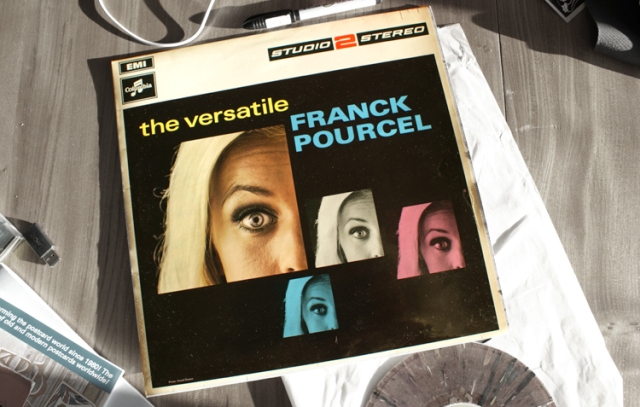
At the top of this page, The Versatile… is a strange experiment in CMYK colour, with the same cropped image of the girl’s head (I almost said blonde, but it ain’t real) by David Davies reused in magenta, black and cyan. I picked this up recently in a charity store, which used to be a good hunting ground for the series until a few years ago. The supply seems to be drying up. Our thinking is that if we suggest the average age for S2S buyers was 30, if they were buying the albums at the time, this means they will now be 70. A sobering thought for us all.

The S2S series then did away with this rather dated white border and top panel format, extending the cover images across the whole cover. The first Pourcel one to go this way was Dancing In The Sun (1971), another PAF travel shot, this time of a woman against a bright blue sky. The series logo was also reduced in size. Thinking Of You dates from the same year, with a dreamy close up from the Tony Stone studio on the cover.

Occasionally Studio 2 used illustrations on the covers, a good example being this fun one for Meet The Beatles, released in 1972. Easy listening albums of Beatles tunes were rife at the time, a sure seller for a middle aged market who wouldn’t dream of buying the originals but liked a good tune. This stencil font is Futura Black, which I’ve always liked. Frustratingly the illustrator isn’t credited, but he or she manages to incorporate references to numerous Beatles song titles in the work. See how many you can spot!


